

A digital waitlist collects data that a paper list never could. Every customer who joins a line, waits, gets notified, and checks in leaves a record. Most operators end up looking at two numbers from all of that: total customers and average wait time. Both matter, but they only scratch the surface of what the data is actually telling you.
| KPI | Formula | What it tells you |
| Average wait time | Time from queue join to notification | Where pressure is building in your queue |
| Walk-away rate | Customers who left before notification ÷ total joined × 100 | Whether your wait or communication is losing customers before you reach them |
| No-show rate | Customers notified but did not check in ÷ total notified × 100 | Whether your notification is too early, too vague, or too easy to ignore |
| Average service time | Time from check-in to served | Whether long waits come from queue length or from service speed |
| Daily average visitors | Total visitors ÷ days in period | Your normalised foot traffic baseline, stripped of calendar noise |
| Peak hour and busiest day | Highest volume hour and day from visit charts | Where to concentrate staffing to prevent queue buildup |
| Average wait by party size | Average wait broken down by 1–2, 3–4, and 5+ groups | Whether large-party delays point to a table configuration problem rather than a queue problem |
| New vs. returning visitor split | New visitors ÷ total visitors × 100 | Whether you are retaining customers or running entirely on new foot traffic |
1— Average wait time
Average wait time measures how long a customer waits from joining your queue to receiving their notification. It is the number most operators already watch, and for good reason: it is the single most direct measure of pressure on your queue.
On its own, the average tells you less than the breakdown by time of day. A restaurant with a 22-minute overall average might have a 111-minute wait at 11am and 12 minutes at 9pm. The overall number looks fine, but the main takeaway is that the 11am number is a problem.
Cross-reference your average wait with the time-of-day chart to find where the pressure actually sits. That is where staffing decisions and scheduling changes will have the most impact.
Benchmarks by vertical
If your numbers sit consistently above the top of those ranges, the queue needs attention:
- Restaurant walk-ins typically wait 15–25 minutes.
- Retail queues tend to move faster, with most customers hitting their limit around 8–12 minutes.
- Clinic and healthcare settings average 18–24 minutes.
2— Walk-away rate
Walk-away rate is the percentage of customers who joined your queue and left before you had a chance to notify them. They came in, saw the wait or saw nothing at all, and decided it wasn't worth it.
This is usually the metric most operators have never tracked, and the one carrying the most immediate revenue implication. Every walk-away is a customer who was ready to spend and left without spending.
The leading cause of walk-aways is not wait length. It is uncertainty. Customers who can see their position in a queue tolerate waits roughly 35% longer than customers left with no information. A 25-minute wait with visible progress feels shorter than a 10-minute wait in silence.
What is a good walk-away rate?
Under 10% is a reasonable target. A walk-away rate above 15–20% usually points to a combination of waits that are genuinely too long and a queue that gives customers no feedback while they wait.
Both are fixable. The first requires operational changes; the second requires a system that keeps customers informed.
 Walk-away Rate in WaitQ
3— No-show rate
No-show rate measures the percentage of customers who were notified that it was their turn and did not check in. They stayed in the queue long enough to get the notification, then disappeared.
No-show and walk-away are often treated as the same problem, but they are not:
- Walk-away means you lost someone before the notification
- No-show means you lost someone after
A high walk-away rate points to the waiting experience. A high no-show rate points to the notification itself: it may have been sent too early, the message may not have set a clear expectation about how long the customer has to return, or the gap between notification and service readiness may be longer than the customer was willing to hold.
What is a good no-show rate?
No-show rates vary by vertical, but 8–18% covers most walk-in service businesses. If your no-show rate is significantly higher than your walk-away rate, review your notification timing and message clarity before assuming the problem is wait length.
4— Average service time
Average service time measures how long a customer takes from checking in to being served.
It is not the queue wait, but rather what happens after the queue. This distinction matters because it tells you where a long wait is actually coming from:
- If average wait time is high but average service time is normal, the problem is queue length: more people are joining than your capacity can clear.
- If average service time is high, the problem is in the service itself, not the line.
A barbershop with a 45-minute average wait and a 6-minute average service time has a staffing problem. The same shop with a 45-minute average wait and a 40-minute average service time has a workflow problem. They look the same from the outside. The data tells them apart.
Track this number alongside average wait time. When one moves without the other, you have a clearer diagnosis.
5— Daily average visitors
Daily average visitors is your total visitor count divided by the number of days in the period. It sounds basic, but it is more useful than total visitors for tracking trends.
Total visitors is sensitive to period length and to days the location was closed. A Monday holiday, a slow week in January, a burst of traffic during a local event: all of these move the total without telling you whether your underlying foot traffic has changed. Daily average normalises for those variations.
Use this number to compare week on week and month on month. A 10% drop in daily average is a signal worth investigating. A 10% drop in total visitors after a shorter month is noise.
It also gives you a planning baseline. If your daily average across 60 days is 75, that is what you should be staffed to handle on a typical day, not your busiest day and not your quietest.
6— Peak hour and busiest day
Your hourly visits chart and your average visitors by day of week chart are most useful when read together. One tells you when your queue is heaviest within a day. The other tells you which days drive the most volume overall.
Combined, they give you the two or three operational windows that matter most: the day-and-hour combinations where your queue is under the most pressure.
Toast's restaurant waitlist data shows that waitlist guests who successfully get a table wait an average of 9 minutes, but customers put on a waitlist stick around for 20 minutes on average before giving up. That gap is where walk-aways happen, and it is widest during peak windows when queue depth builds faster than staff can clear it.
If Saturday is your busiest day and 11am is your highest-volume hour, Saturday 11am is your minimum staffing baseline. Scheduling to your average across the week will leave you underprepared for the times that actually matter.
7— Average wait by party size
Larger parties wait longer. That is expected: fitting a group of six requires the right table at the right time, and those opportunities come up less frequently than tables for two.
What the data tells you is whether the gap is proportionate or is a sign of something structural.
This metric is particularly useful for restaurants. A consistently high large-party wait suggests the problem sits at the floor level, not the queue level.
In WaitQ's analytics, average wait is broken down by 1–2, 3–4, and 5+ party sizes. If your 5+ wait is twice your 1–2 wait, that is within a normal range for most venues. If it is three or four times longer, the issue may not be the queue at all: it may be table configuration, how you are allocating large tables, or whether your staff is holding large tables in anticipation of reservations while walk-in groups wait.
8— New vs. returning visitor split
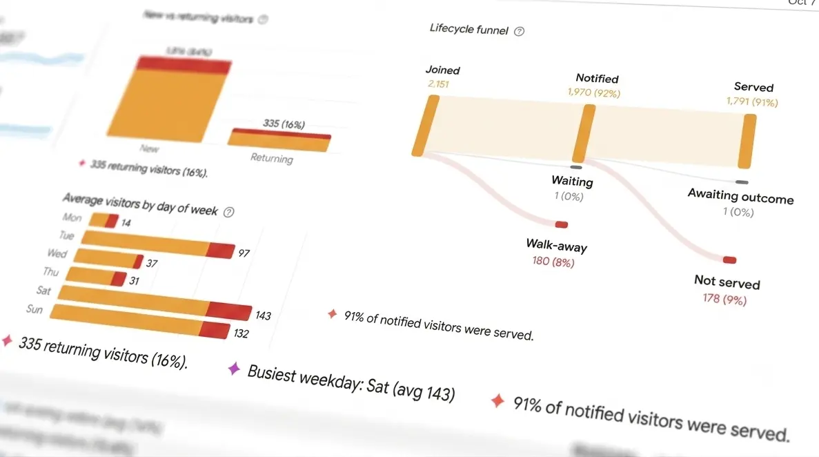
Your analytics show what proportion of visitors in a given period were first-time customers versus people who had been through your queue before. In most walk-in businesses, new visitors outnumber returning ones by a wide margin.
A high new visitor ratio is not a concern on its own. Use this number as context for your other metrics, not as a standalone KPI. However, when the ratio shifts, or when you compare it against total volume, it can signal something worth looking at:
- A high new ratio with declining total volume suggests your location is not attracting as many new customers as it used to, and you are not retaining the ones you have.
- A high returning ratio with high wait times is a different pattern: your regulars are coming back despite long waits, but that tolerance has limits, and long waits are a retention risk even for loyal customers.
WaitQ's platform data shows approximately 81% new visitors across active locations, which reflects the nature of walk-in foot traffic: most of it is opportunistic.
How to read these KPIs together?
Each of these metrics is a diagnostic tool providing insights onto your waiting experience. The combination is what tells you where to look in order to get useful insights.
- A high walk-away rate with a normal average wait time is a common one. The overall average looks fine because wait times are reasonable most of the day. But if you check the time-of-day chart, there may be a two-hour window each morning where the queue backs up sharply. The daily average is masking a peak problem.
- A high no-show rate with a low walk-away rate points directly at notification. The queue is managing well enough that customers stay. They leave after the notification, which means the message, the timing, or the check-in window needs adjustment.
- A high average service time alongside a high average wait time suggests the same staffing or workflow problem is generating both. Fixing queue management without addressing service time will not reduce the wait: new customers will keep backing up behind the ones taking longer to serve.
Tracking wait metrics with WaitQ
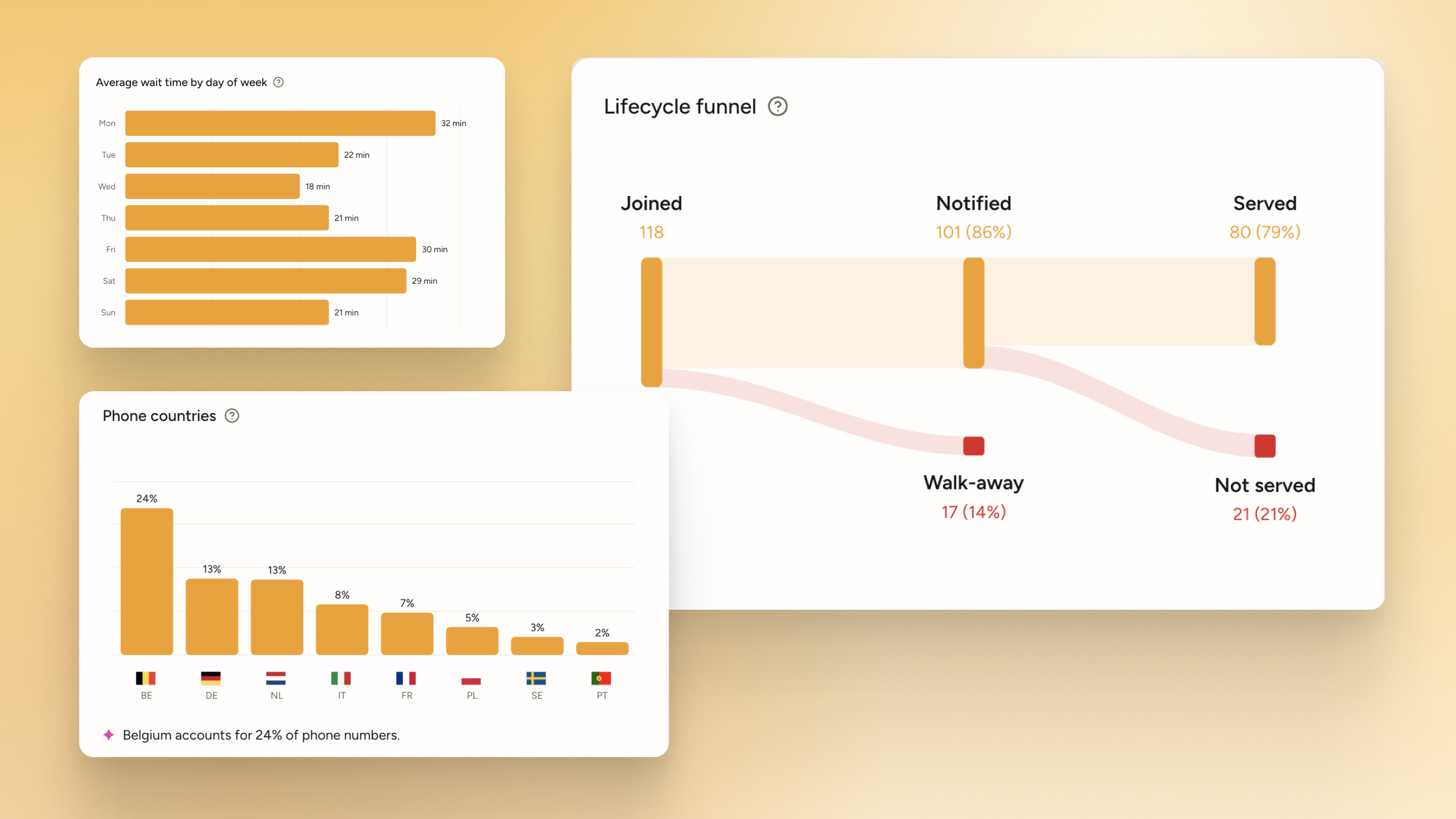
All eight metrics above are available in WaitQ's analytics dashboard with no additional setup. The lifecycle funnel shows walk-away and no-show side by side, which is the clearest way to see which failure mode is larger. The hourly visits chart and the time-of-day wait chart sit on the same page, ready to be read together. Average wait by party size is broken down into three groups. New vs. returning visitors is tracked automatically.
If you are already using WaitQ, your numbers are there. If you want to see what your queue is actually doing, the 7-day free trial gives you enough data within the first week of normal operation to work with.
